
Picture of Adam Smith.
The Lorenz Curve
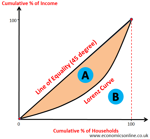
The graphical representation of the distribution of income or wealth in a country is called the Lorenz curve.
The Lorenz curve was developed by an American economist, Max O. Lorenz, in 1905 as a graphical representation of income inequality and is an important concept in Economics because it is one of the simplest ways to illustrate the level of economic inequality in society.
The Lorenz curve provides a method of displaying the distribution of income or wealth within an economy.
One of the macroeconomic objectives of the government is ‘equal distribution of income and wealth’. In order to use any policy to achieve this objective, the government must first measure the level of inequality in income or wealth distribution. The Lorenz curve is used to measure the inequality of income or wealth distribution in a country.
The Graph of the Lorenz Curve
The Lorenz curve displays the cumulative share of income from various sections of the population. The Lorenz curves graph the percentiles of the population against cumulative income or wealth of people at or below that percentile.
Consider the following table for constructing the Lorenz curve.
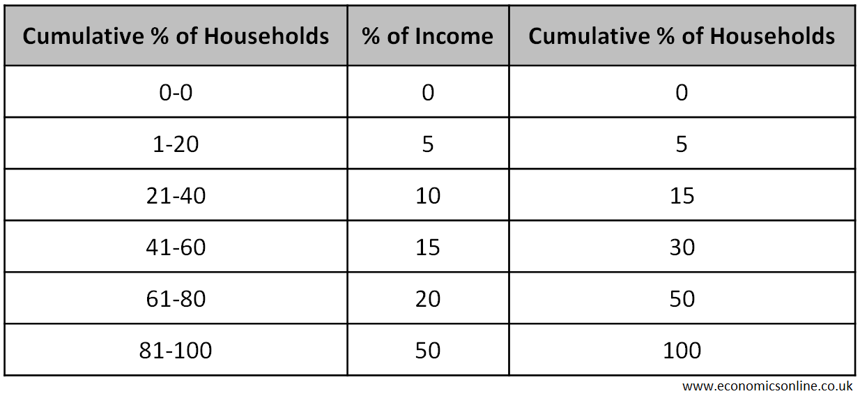
In the above table, the poorest 20% of households only have 5% of the total income of the nation. Meanwhile, the poorest 80% hold 50% of the total income, leaving the richest 10% with 50% of the total income.
In order to plot the graph of the Lorenz curve, we take the cumulative % of households on the X-axis (the horizontal axis) and the cumulative % of income on the Y-axis (the vertical axis). The 45 degree line (the line of equality or the line of perfect equality) is drawn as a straight diagonal line to show the perfectly equal distribution of income. If perfect equality were to exist (if everyone had the same salary), the poorest 20% of the population would then gain 20% of the total income. Meanwhile, the poorest 60% of the population would receive 60% of the income.
The line of equality is used to compare with the Lorenz curve to find the extent of inequality in the income distribution.
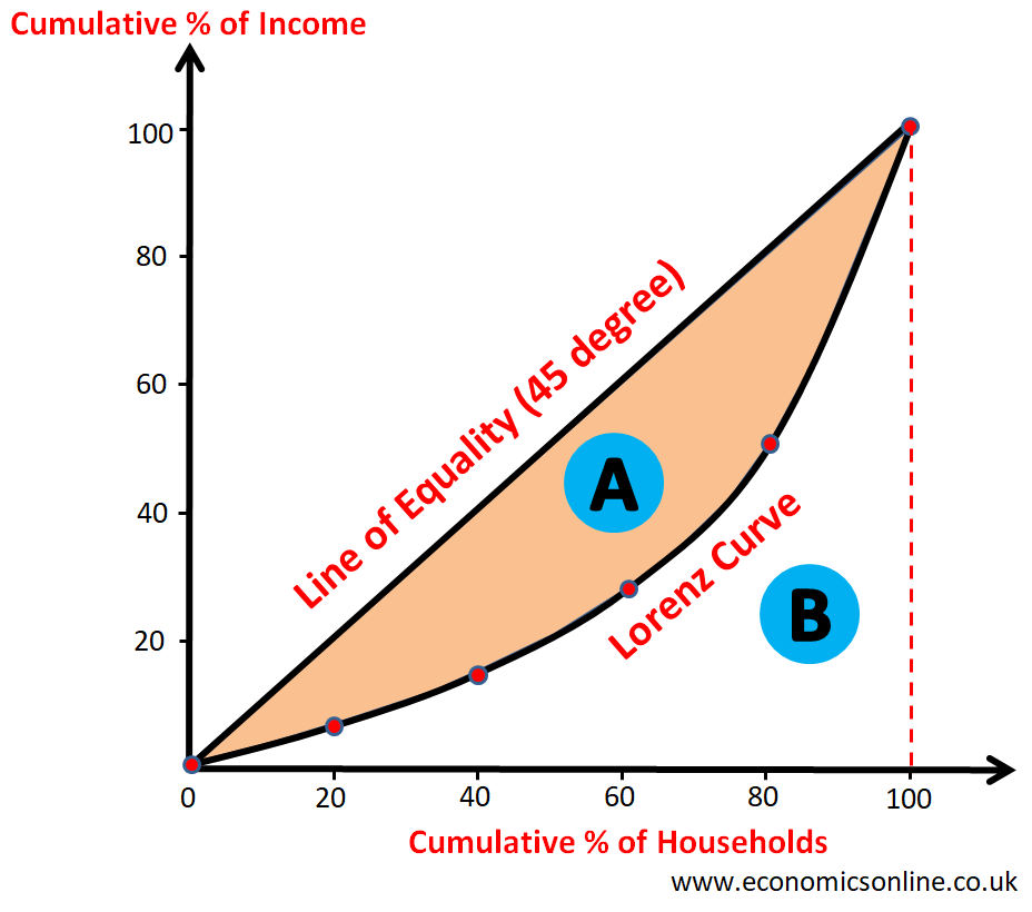
The shape of the Lorenz curve is convex.
If the Lorenz curve is away from 45 degree line, it shows higher inequality in income distribution.
Area ‘A’ shows income inequality.
The greater the area ‘A’, the greater the inequality in the distribution of income in a country.
The smaller the area ‘B’, the greater the inequality in the distribution of income in a country.
Comparing the Income Distribution of a Country Over Time
The Lorenz curve can be used to compare income inequality within a country over the period of time. Consider the following diagram, which shows two Lorenz curves.
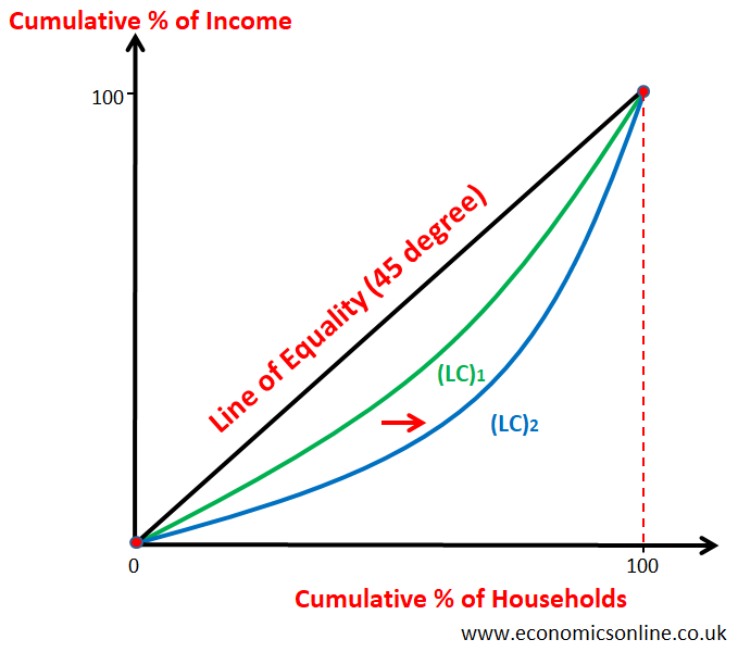
- The initial Lorenz curve for country X is (LC)1 which is closer to 45 degree line and hence it which shows lower inequality in the distribution of income in country X.
- The final Lorenz curve (after the shift) for country X is (LC)2 which is away from 45 degree line and hence it shows higher inequality in the distribution of income in country X.
- Over the period of time (may be due to economic growth), LC is shifted away from 45 degree line leading to higher income inequality in country X.
- In the example above, an increase in inequality has taken place. You can see that the Lorenz curve has moved and is now away from the line of equality. This shows an increase in the income inequality.
Comparing the Income Distribution between Countries
The Lorenz curve can be used to compare income inequality between countries. Consider the following diagram.
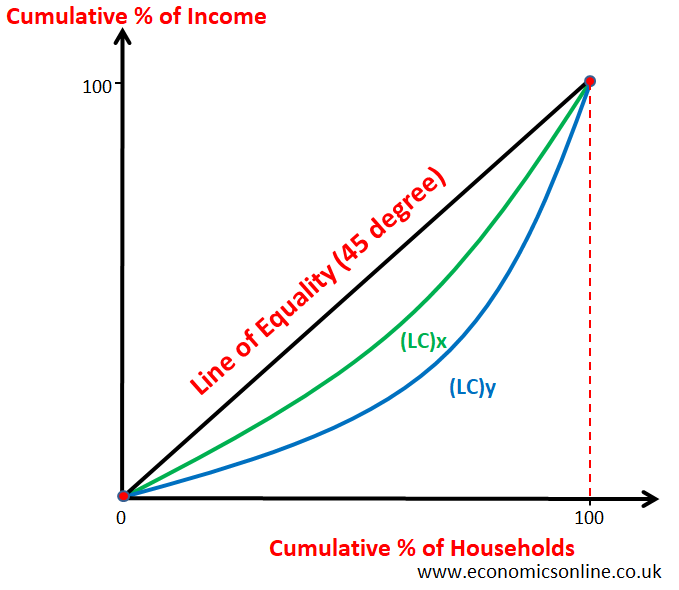
- The Lorenz curve for country X i.e. (LC)x is closer to 45 degree line which shows lower inequality in the distribution of income in country X.
- The Lorenz curve for country Y i.e. (LC)y is away from 45 degree line which shows higher inequality in the distribution of income in country Y.
Limitations of the Lorenz Curve
- It is graphical representation and hence cannot be used to compare income distribution between many countries.
- It cannot be used to compare income distribution over the period of many years.
- The magnitude of difference between inequality of distribution cannot be compared by using the Lorenz curve.
- Government cannot have numeric target for re-distribution of income on the basis of the Lorenz curve only.
The Lorenz Curve and the Gini Coefficient
The Gini Coefficient is another measure of inequality, and it can be calculated by using the Lorenz curve.
It is a number which is used to measure income inequality in a country and is also called Gini Ratio or Gini Index.
Formula
Gini Coefficient = (Area Between 45 degree line and LC)/(Area below 45 degree line)
Gini Coefficient = (Area A)/(Area A + Area B)
- Values of Gini Coefficient can be from 0 to 1.
- 0 and 1 are ideal values and in real life, values of the Gini Coefficient are between 0 and 1.
- If income distribution is equal, Area A will be zero and Gini coefficient will have a value of 0.
- If all income is with one person, Area B will be zero and Gini coefficient will be 1.
- Higher value of Gini Coefficient shows higher income inequality.
- Area A becomes smaller the closer the Lorenz curve is to the line of equality. The Gini Coefficient will be low in this situation. But if there’s a high degree of inequality, area A will take up a larger percentage of the total area.
- When the Gini Coefficient rises, it shows a rise in inequality. It shows that the Lorenz curve is further from the line of equality.
- A Gini coefficient of 0.35 indicates a more equal distribution of income than a coefficient of 0.65.
- The trend in Gini Coefficient is important as it indicates whether income distribution is becoming more equal or unequal over time.
- Government can set target in terms of Gini Coefficient (say 0.25).
Limitations of the Gini Coefficient
- Extensive data may be needed to calculated Gini Coefficinet.
- Two countries with different income distributions may have the same Gini coefficient.
The Lorenz Curve and Wealth
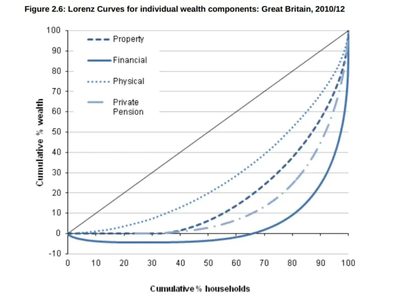
In the Lorenz Curve, you can see the cumulative wealth of each of the wealth deciles. For instance, it shows that the lowest 38% of people have zero property wealth. The top 10%, however, own almost 50% of the property wealth.
When you look at financial wealth, the inequality is even greater. 60% of the population is in debt and has negative wealth. At the same time, the top 10% has 80% of the nation’s financial wealth.
The Gini Coefficient in the UK
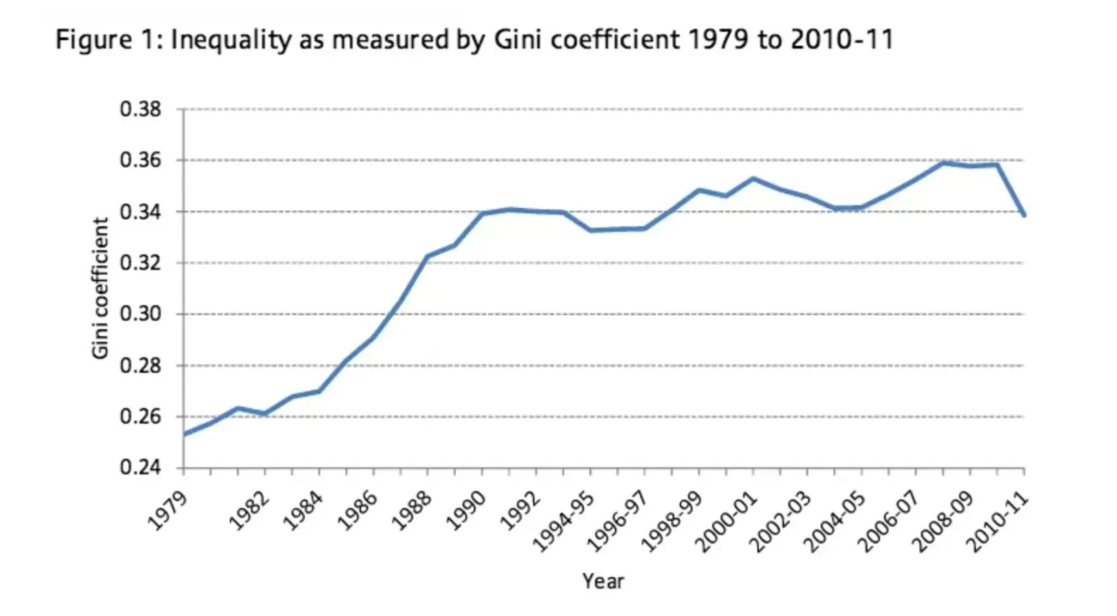
Here you can see that the UK has experienced a rise in inequality since 1979. This is especially apparent during the 1980s.
The Original Lorenz Curve
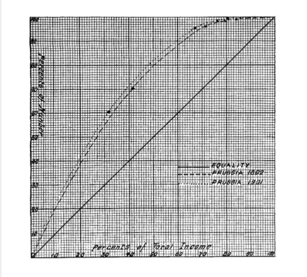
The very first Lorenz Curve had the percentage of population and percentage of total income on opposite axes.